Wednesday, 15 March 2017

Shot evaluations


Shot Evaluation:


Over the shoulder shot of the murderer:

The over the shoulder shot of the Murderer looking at one of the victims is an important shot as it presents the vulnerability of the victim being tied up. The murderer was just standing, watching and not helping the victim, this portrays the mystery murderer as evil and inhumane. The shot also represents the vulnerability of the girl victim, as she cannot escape and the murderer could do anything to her. No one is around to see her or hear her scream therefore she is also isolated.

The over the shoulder shot was an effective shot as the audience feel as if they’re the murderer looking onto the victim. The audience would also possibly feel tension or guilt if they were to become the murderer.


Shot of train doors opening:

The wide angle long shot was a critical shot as it again shows another victim who’s been stranded on the train. Again it shows the vulnerability of the victim, but this shot was a long take therefore also was an establishing shot. This is due to showing the vehicle (train) therefore the audience know it is at a train station. It also helps set the scene as our opening two minutes is only set within the station therefore it is a critical aspect of the storyline.
 

Shot of the time counting down:


The close up shots of the timer counting down was put in place to show the timings of the day but also to count down the time until the death of the victims. These shots create tension as the audience at first wouldn’t know why there timer is counting down until further into the two minutes. We decided to use this countdown type of countdown as it was a good colour scheme to accompany the horror genre.

Help shot:

The close up ‘help’ from one of the victims is shown as a close up to emphasise her mouthing the word. The word is also significant as it shown that the girl is helpless. The shot was filmed just outside the train but because the lighting was similar it worked. The close up also showed the audience the victims scars and bruises representing the abuse and trauma the victim had gone through.

Waiting room shot:

This shot was a high angle medium shot of one of the victim’s legs, alongside the legs there was pool of ‘petrol’ though we used water from the rain outside showing that we used our resources around us. The petrol can was also present to make the audience think that petrol was used. This high angle shot shows the helplessness and weakness and vulnerability of the victim and the murderer looking down on them showing that the murderer is superior.

Wrists shot:

The shots of one of victims wrists show the rope that she is tied up with, also it shows the wounds that the girl has gained through the trauma, the wounds are supposedly from the rope therefore gives the audience the illusion that the rope was really tight so much that it scared and cut her. The struggling hands show that she cannot move, the hands being in the foreground and in focus show that they’re the focus of the shot.

Thursday, 9 March 2017

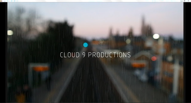
Production company title - Re evaluated


After deliberation, as a group we decided that our first idea of the production company title was too unprofessional. We spent a lot of time on our first idea however, we didn’t feel that it was right and professional enough for our media project.
Therefore, we set to work trying to come up with something that looked more professional, we went through ideas of keeping the cloud made up of nines, however we decided to get rid of it and to just keep it plain and simple.
To keep it simple we went for a simple font, but also decided to put a backing video which was an establishing shot of the train station, this was so it set the scene, and it also creates an enigma code that the station and trains play a vital part of it. The establishing shot behind the production company title blurs, we used this to our advantage to then put the company title over the top to make the title the focus for a few seconds.
There were certain aspects of the title we liked such as the thunder effect but also having some white within the title. We wanted to keep the thunder effect, so we found a way to put it over the title coming up onto the screen, alongside this as we wanted the thunder we needed to show a storm, however in the shot there isn’t real rain, therefore we used a rain simulator on adobe after effects and this worked perfectly.
When looking at different fonts, we went through almost 100, until we came up with a shortlist of 5. However, two were the same font but one was in bold.
The first font we thought didn’t represent our company as we though that the company would also have to look sinister, as we thought that if we were to make more films, that it would be again of the horror genre.
The second font was too bold to be our font, and the 9 was too small.  The third font we liked but didn’t think that it would stand out. The fourth font was actually one of the first fonts we looked at but we thought it was a typical typing font. Therefore we ended with number five. This was number three but in bold, we liked this as it would stand out more and it made the company title look more professional.
This is our final production company title opening:

Filming diary day 3


Date: 27th February 2017     

Location: Stoneleigh station
We were hoping this would be our final day of filming, focusing on capturing the final male actors sections in the waiting room and the knife scene. The male actor was thankfully available on this day and we managed to film the variety of high, low and close up angles of him being unconscious in the waiting room. We filmed these quite early on the day as the waiting room was already quite dark and isolated.


After long deliberation we choose not to film the knife section at the station as we didn’t want to affect or offend anyone on their day to day lives and we didn’t really fancy getting in trouble. So opted to film it out the front of one of our houses.

Filming was complete.        

Friday, 3 March 2017

Editing process continued

Having completed our final day of filming, it was time to do the last bit of our editing and put it all together. We had filmed our last victim and a few key shots (e.g. the two watches displaying the time which we would later use as a graphic match) and uploaded all the footage to the computer.

 We began editing and thought it was important to make our footage look realistic. This is why it was so frustrating when it came to things like the use of phones and watches, as the dates and times weren't correct due to us filming different parts of our film on different days at different times. Some of these factors we didn't realise until after we had finished filming so were left with a few solutions to solve.

We realised that the time and date was wrong during the end of our opening and beginning of our narrative due to it being much later than we decided that it would be. We thought of some different solutions to the problem including changing the time that the events took place (but that could confuse out storyline), refilm the clips that included the time or date being shown (but that requires our actors again and we felt unfair asking for their help for a fourth time) so we came to the conclusion to remove these shots from our storyline and replace them with a countdown/timer to show the different times in the day.

Below is a short video explaining how we undergone our editing process.


Thursday, 2 March 2017

Our editing experiences


So as you have read from our previous post, we developed our knowledge and ability of using adobe after effects through an industry professional, Ben, who came to talk us through how to use the software. Having used this, we developed our titles by trying out lots of different fonts and colours. Firstly, we inserted the footage that we would be using into adobe after effects so we could discover instantly what our footage would look like. We began by typing in our title and then trying lots of different fonts until we found one that we all liked and had connotations to our narrative and horror genre, without being predictable (with blood dripping for example.) We literally tried out over 100 fonts, ranking them out of 10 on how much we liked them. We then, having found our perfect font, needed to find an effect/animation that complimented its aesthetic. Again, we tried out hundreds of different animations but settled for a simple appear, and then tear away effect as we didn’t want to distract from the establishing shot.


This combination of font and animation links to our narrative and genre as it is quite creepy, and could be interpreted as ghost like, and linking to the paranormal (which is a convention of the horror genre.) Our final production title can be seen in our final cut.

Production Company Visit From Ben (Freelance worker)


Production Titles:

On Friday 3rd February, we had a visit from an industry professional who came in and taught us about how to use adobe after effects. This allowed us to create some high quality titles ready to be used in our opening scene.

The different effects we practised include:

•Smoke making text appear

•Titles moving with items in the video

•Colour correction enabling us to darken some bits of our footage which looked out of place due to them being shot earlier in the day

This was good as it was helpful to be able to ask questions to someone who was experienced and could give us a quick and easy solution to our problems. They also gave us some keyboard shortcuts which allowed us to speed up our editing process.

Overall it was a really useful experience which built our confidence when it came to making our final titles.


How we created our special effects make up?

We watched a number of YouTube videos and searched the internet of photos, for ideas of how to create the most realistic cuts and bruises for our victims. We came across a couple of pictures and one particular YouTube video (shown below) that inspired us the most as it was similar to what we had imagined the makeup would look like in our heads. The video showed the women using the following fake blood, tissue paper, glue, foundation, powder, setting spray and an eyeshadow pallet. She started off by placing a trail of glue along the hand to create the basic shape of the cut, then she applied scrunched up bits of toilet paper and stuck them onto the glue to create the 3D effect. She then used a make up brush to spread out the glue and create more of a shape, then adding foundation to blend the white colour out and make it more realistic. To dry this out she added a powder, then applied predominately shades or reds and browns. We thought that when we would use ours we would use more base colours like browns and greens to create more of a bruised look first then adding the reds over the top. The look was nearly finished but the women used a clever trick before adding the fake blood she used setting spray to give the look a dewy touch as if it the cut was still oozing with blood. Finally she added the fake blood using her fingers she spread it over and around the cut.

This video was very helpful as it give us some ideas of how to create the most realistic cuts and bruises. We gathered the following equipment from around our houses and had a couple of times practising on each other before we had mastered creating the special effects make up.


Equipment:

-Fake blood
-Eyeshadow pallet (mainly using greens, browns and purples)
-Red and pink lipstick
-Cotton buds
-Glue
- Eyebrow pencils (different shades of browns)


We started off a little different from the tutorial and used a mix of dark and light greens and dark browns to create a bass colour for the bruises. We then applied glue over the top in the shape of whatever cut we wanted, instead of using tissue paper we ripped of little strands from cotton buds and stuck them over the top for the 3D effect. We then used a mix of neutral colours for a skin tone too harsh reds and browns from the pallet to create the right colour. We then squeezed blood all over the wound for the final touch adding the realistic element.