After deliberation, as a group we decided that our first
idea of the production company title was too unprofessional. We spent a lot of
time on our first idea however, we didn’t feel that it was right and
professional enough for our media project.
Therefore, we set to work trying to come up with
something that looked more professional, we went through ideas of keeping the
cloud made up of nines, however we decided to get rid of it and to just keep it
plain and simple.
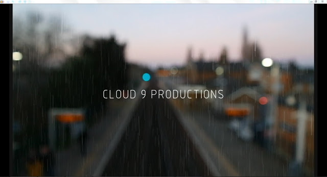
 To keep it simple we went for a simple font, but also
decided to put a backing video which was an establishing shot of the train
station, this was so it set the scene, and it also creates an enigma code that
the station and trains play a vital part of it. The establishing shot behind
the production company title blurs, we used this to our advantage to then put
the company title over the top to make the title the focus for a few seconds.
To keep it simple we went for a simple font, but also
decided to put a backing video which was an establishing shot of the train
station, this was so it set the scene, and it also creates an enigma code that
the station and trains play a vital part of it. The establishing shot behind
the production company title blurs, we used this to our advantage to then put
the company title over the top to make the title the focus for a few seconds.
There were certain aspects of the title we liked such as
the thunder effect but also having some white within the title. We wanted to
keep the thunder effect, so we found a way to put it over the title coming up
onto the screen, alongside this as we wanted the thunder we needed to show a
storm, however in the shot there isn’t real rain, therefore we used a rain
simulator on adobe after effects and this worked perfectly.
When looking at different fonts, we went through almost
100, until we came up with a shortlist of 5. However, two were the same font
but one was in bold.
The first font we thought didn’t represent our company as
we though that the company would also have to look sinister, as we thought that
if we were to make more films, that it would be again of the horror genre.
The second font was too bold to be our font, and the 9
was too small. The third font we liked
but didn’t think that it would stand out. The fourth font was actually one of
the first fonts we looked at but we thought it was a typical typing font.
Therefore we ended with number five. This was number three but in bold, we
liked this as it would stand out more and it made the company title look more
professional.
This is our final production company title opening:

No comments:
Post a Comment